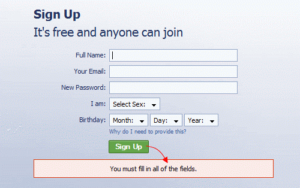
It is understood that forms which are successful in luring your visitors and those that are quite easy and simple to complete would lead to an increased time spent by your visitor on your web page. This would be successfully driving more clients to your specific product or service. The importance of an excellent form is certainly impossible to undermine. Follow the guidelines below to present forms in a manner that would really be useful to your users.
Seek Only Required Information and Use a Logical Format
The best form is one that does not demand information but is more like a conversation. Just like any other logical conversation, a good form must consider following a communication between your app and your user. This could be achieved by:
You must ask questions in sequence. This would be including presentation of data and information in a logical and meaningful manner. If you see that there exists no meaningful order, you could order options simply alphabetically.
While coming up with a form, you must know in your mind clearly why you are asking a particular question and what you are planning to do with this sort of information. If you wish to boost the completion rates, you must reduce user effort.
Consider Using a Single-Column Format
Your form must contain only the required information to keep it really short enough for using a single-column format. Avoid horizontally adjacent fields as they would be slowing down comprehension and creating user attention lags. The best form usually has a clear-cut path to completion and it is straight down your page.
Consider Minimizing Typing Effort
You must make sincere efforts to cut down the total number of input fields and strive to minimize the typing effort of your users, especially, on a mobile. You must consider using checkboxes, drop-down menus and also radio buttons for not only minimizing your users’ effort but also addressing the errors that are inherent in typing, particularly, on mobile.
Lure Your Users and Get a Form Filled
One of the most effective ways of attracting your users to fill out your form is simply by making them really want to do so. Here are some tactics that your website could adopt for enticing the users to fill out the form.
- Mention clearly the benefits that would be enjoyed by the user upon form completion. You must consider providing a list of features, benefits or ways you would be helping out your clients. It could be a promo code meant for future purchase once the visitor has completed the form.
- Focus on building your brand credibility simply by providing adequate social proof, for instance, showcases or testimonials around your form. This would be effectively demonstrating that people are actually relying on you for providing a vital service or a product. This would be successfully creating a human bonding with the brand. You must include images for driving it home.
- Cleary let your users know that you really value their privacy. Tell them explicitly that they would not be receiving any spam.
Include a Compelling CTA
You simply cannot undermine the role of a call to action. It is regarded as the first and most important step towards conversion. It would be compelling visitors to click the sign-up button. You must tell the user what you actually do, reasons why they would need you and specifically how you are way different from others and that there is no match for you. Your CTA should be able to do all this and that too, do it real quick.
You must always consider putting yourself into the client’s shoes. Bold is the word. You need to use bold colors, fonts, shapes, placement and words for attracting immediate attention. Select a contrasting and bold color which would be clearly communicating an action to the site visitor. Place your CTA or Call to Action in the main footer or navigation so that it is clearly visible all across your website.
Conclusion
You must draw the attention of the visitors to your form with a really compelling Call-to-Action or CTA and make sure that your form is easily navigable and has natural language. This would be luring your users towards form completion that would be resulting in more and more business in the years to come.
This article was contributed by Evans Walsh. Visit Las Vegas Web Design Co.com for professional web designing solutions and to learn more.

